Python數據相關系數矩陣和熱力圖輕松實現教程
對其中的參數進行解釋
plt.subplots(figsize=(9, 9))設置畫面大小,會使得整個畫面等比例放大的
sns.heapmap()這個當然是用來生成熱力圖的啦
df是DataFrame, pandas的這個類還是很常用的啦~
df.corr()就是得到這個dataframe的相關系數矩陣
把這個矩陣直接丟給sns.heapmap中做參數就好啦
sns.heapmap中annot=True,意思是顯式熱力圖上的數值大小。
sns.heapmap中square=True,意思是將圖變成一個正方形,默認是一個矩形
sns.heapmap中cmap='Blues'是一種模式,就是圖顏色配置方案啦,我很喜歡這一款的。
sns.heapmap中vmax是顯示最大值
import seaborn as snsimport matplotlib.pyplot as pltdef test(df): dfData = df.corr() plt.subplots(figsize=(9, 9)) # 設置畫面大小 sns.heatmap(dfData, annot=True, vmax=1, square=True, cmap='Blues') plt.savefig(’./BluesStateRelation.png’) plt.show()
補充知識:python混淆矩陣(confusion_matrix)FP、FN、TP、TN、ROC,精確率(Precision),召回率(Recall),準確率(Accuracy)詳述與實現
一、FP、FN、TP、TN
你這蠢貨,是不是又把酸葡萄和葡萄酸弄“混淆“”啦!!!
上面日常情況中的混淆就是:是否把某兩件東西或者多件東西給弄混了,迷糊了。
在機器學習中, 混淆矩陣是一個誤差矩陣, 常用來可視化地評估監督學習算法的性能.。混淆矩陣大小為 (n_classes, n_classes) 的方陣, 其中 n_classes 表示類的數量。
其中,這個矩陣的一行表示預測類中的實例(可以理解為模型預測輸出,predict),另一列表示對該預測結果與標簽(Ground Truth)進行判定模型的預測結果是否正確,正確為True,反之為False。
在機器學習中ground truth表示有監督學習的訓練集的分類準確性,用于證明或者推翻某個假設。有監督的機器學習會對訓練數據打標記,試想一下如果訓練標記錯誤,那么將會對測試數據的預測產生影響,因此這里將那些正確打標記的數據成為ground truth。
此時,就引入FP、FN、TP、TN與精確率(Precision),召回率(Recall),準確率(Accuracy)。
以貓狗二分類為例,假定cat為正例-Positive,dog為負例-Negative;預測正確為True,反之為False。我們就可以得到下面這樣一個表示FP、FN、TP、TN的表:
此時如下代碼所示,其中scikit-learn 混淆矩陣函數 sklearn.metrics.confusion_matrix API 接口,可以用于繪制混淆矩陣
skearn.metrics.confusion_matrix( y_true, # array, Gound true (correct) target values y_pred, # array, Estimated targets as returned by a classifier labels=None, # array, List of labels to index the matrix. sample_weight=None # array-like of shape = [n_samples], Optional sample weights)
完整示例代碼如下:
__author__ = 'lingjun'# welcome to attention:小白CV import seaborn as snsfrom sklearn.metrics import confusion_matriximport matplotlib.pyplot as pltsns.set() f, (ax1,ax2) = plt.subplots(figsize = (10, 8),nrows=2)y_true = ['dog', 'dog', 'dog', 'cat', 'cat', 'cat', 'cat']y_pred = ['cat', 'cat', 'dog', 'cat', 'cat', 'cat', 'cat']C2= confusion_matrix(y_true, y_pred, labels=['dog', 'cat'])print(C2)print(C2.ravel())sns.heatmap(C2,annot=True) ax2.set_title(’sns_heatmap_confusion_matrix’)ax2.set_xlabel(’Pred’)ax2.set_ylabel(’True’)f.savefig(’sns_heatmap_confusion_matrix.jpg’, bbox_inches=’tight’)
保存的圖像如下所示:
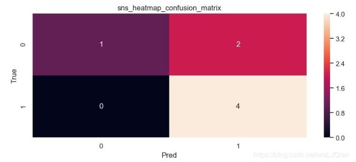
這個時候我們還是不知道skearn.metrics.confusion_matrix做了些什么,這個時候print(C2),打印看下C2究竟里面包含著什么。最終的打印結果如下所示:
[[1 2] [0 4]][1 2 0 4]
解釋下上面這幾個數字的意思:
C2= confusion_matrix(y_true, y_pred, labels=['dog', 'cat'])中的labels的順序就分布是0、1,negative和positive
注:labels=[]可加可不加,不加情況下會自動識別,自己定義
cat為1-positive,其中真實值中cat有4個,4個被預測為cat,預測正確T,0個被預測為dog,預測錯誤F;
dog為0-negative,其中真實值中dog有3個,1個被預測為dog,預測正確T,2個被預測為cat,預測錯誤F。
所以:TN=1、 FP=2 、FN=0、TP=4。
TN=1:預測為negative狗中1個被預測正確了
FP=2 :預測為positive貓中2個被預測錯誤了
FN=0:預測為negative狗中0個被預測錯誤了
TP=4:預測為positive貓中4個被預測正確了
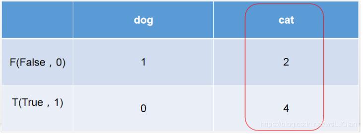
這時候再把上面貓狗預測結果拿來看看,6個被預測為cat,但是只有4個的true是cat,此時就和右側的紅圈對應上了。
y_pred = ['cat', 'cat', 'dog', 'cat', 'cat', 'cat', 'cat']y_true = ['dog', 'dog', 'dog', 'cat', 'cat', 'cat', 'cat']
二、精確率(Precision),召回率(Recall),準確率(Accuracy)
有了上面的這些數值,就可以進行如下的計算工作了
準確率(Accuracy):這三個指標里最直觀的就是準確率: 模型判斷正確的數據(TP+TN)占總數據的比例
'Accuracy: '+str(round((tp+tn)/(tp+fp+fn+tn), 3))
召回率(Recall): 針對數據集中的所有正例label(TP+FN)而言,模型正確判斷出的正例(TP)占數據集中所有正例的比例;FN表示被模型誤認為是負例但實際是正例的數據;召回率也叫查全率,以物體檢測為例,我們往往把圖片中的物體作為正例,此時召回率高代表著模型可以找出圖片中更多的物體!
'Recall: '+str(round((tp)/(tp+fn), 3))
精確率(Precision):針對模型判斷出的所有正例(TP+FP)而言,其中真正例(TP)占的比例。精確率也叫查準率,還是以物體檢測為例,精確率高表示模型檢測出的物體中大部分確實是物體,只有少量不是物體的對象被當成物體。
'Precision: '+str(round((tp)/(tp+fp), 3))
還有:
('Sensitivity: '+str(round(tp/(tp+fn+0.01), 3)))('Specificity: '+str(round(1-(fp/(fp+tn+0.01)), 3)))('False positive rate: '+str(round(fp/(fp+tn+0.01), 3)))('Positive predictive value: '+str(round(tp/(tp+fp+0.01), 3)))('Negative predictive value: '+str(round(tn/(fn+tn+0.01), 3)))
三.繪制ROC曲線,及計算以上評價參數
如下為統計數據:
__author__ = 'lingjun'# E-mail: 1763469890@qq.com from sklearn.metrics import roc_auc_score, confusion_matrix, roc_curve, aucfrom matplotlib import pyplot as pltimport numpy as npimport torchimport csv def confusion_matrix_roc(GT, PD, experiment, n_class): GT = GT.numpy() PD = PD.numpy() y_gt = np.argmax(GT, 1) y_gt = np.reshape(y_gt, [-1]) y_pd = np.argmax(PD, 1) y_pd = np.reshape(y_pd, [-1]) # ---- Confusion Matrix and Other Statistic Information ---- if n_class > 2: c_matrix = confusion_matrix(y_gt, y_pd) # print('Confussion Matrix:n', c_matrix) list_cfs_mtrx = c_matrix.tolist() # print('List', type(list_cfs_mtrx[0])) path_confusion = r'./records/' + experiment + '/confusion_matrix.txt' # np.savetxt(path_confusion, (c_matrix)) np.savetxt(path_confusion, np.reshape(list_cfs_mtrx, -1), delimiter=’,’, fmt=’%5s’) if n_class == 2: list_cfs_mtrx = [] tn, fp, fn, tp = confusion_matrix(y_gt, y_pd).ravel() list_cfs_mtrx.append('TN: ' + str(tn)) list_cfs_mtrx.append('FP: ' + str(fp)) list_cfs_mtrx.append('FN: ' + str(fn)) list_cfs_mtrx.append('TP: ' + str(tp)) list_cfs_mtrx.append(' ') list_cfs_mtrx.append('Accuracy: ' + str(round((tp + tn) / (tp + fp + fn + tn), 3))) list_cfs_mtrx.append('Sensitivity: ' + str(round(tp / (tp + fn + 0.01), 3))) list_cfs_mtrx.append('Specificity: ' + str(round(1 - (fp / (fp + tn + 0.01)), 3))) list_cfs_mtrx.append('False positive rate: ' + str(round(fp / (fp + tn + 0.01), 3))) list_cfs_mtrx.append('Positive predictive value: ' + str(round(tp / (tp + fp + 0.01), 3))) list_cfs_mtrx.append('Negative predictive value: ' + str(round(tn / (fn + tn + 0.01), 3))) path_confusion = r'./records/' + experiment + '/confusion_matrix.txt' np.savetxt(path_confusion, np.reshape(list_cfs_mtrx, -1), delimiter=’,’, fmt=’%5s’) # ---- ROC ---- plt.figure(1) plt.figure(figsize=(6, 6)) fpr, tpr, thresholds = roc_curve(GT[:, 1], PD[:, 1]) roc_auc = auc(fpr, tpr) plt.plot(fpr, tpr, lw=1, label='ATB vs NotTB, area=%0.3f)' % (roc_auc)) # plt.plot(thresholds, tpr, lw=1, label=’Thr%d area=%0.2f)’ % (1, roc_auc)) # plt.plot([0, 1], [0, 1], ’--’, color=(0.6, 0.6, 0.6), label=’Luck’) plt.xlim([0.00, 1.0]) plt.ylim([0.00, 1.0]) plt.xlabel('False Positive Rate') plt.ylabel('True Positive Rate') plt.title('ROC') plt.legend(loc='lower right') plt.savefig(r'./records/' + experiment + '/ROC.png') print('ok') def inference(): GT = torch.FloatTensor() PD = torch.FloatTensor() file = r'Sensitive_rename_inform.csv' with open(file, ’r’, encoding=’UTF-8’) as f: reader = csv.DictReader(f) for row in reader: # TODO max_patient_score = float(row[’ai1’]) doctor_gt = row[’gt2’] print(max_patient_score,doctor_gt) pd = [[max_patient_score, 1-max_patient_score]] output_pd = torch.FloatTensor(pd).to(device) if doctor_gt == '+': target = [[1.0, 0.0]] else: target = [[0.0, 1.0]] target = torch.FloatTensor(target) # 類型轉換, 將list轉化為tensor, torch.FloatTensor([1,2]) Target = torch.autograd.Variable(target).long().to(device) GT = torch.cat((GT, Target.float().cpu()), 0) # 在行上進行堆疊 PD = torch.cat((PD, output_pd.float().cpu()), 0) confusion_matrix_roc(GT, PD, 'ROC', 2) if __name__ == '__main__': inference()
若是表格里面有中文,則記得這里進行修改,否則報錯
with open(file, ’r’) as f:
以上這篇Python數據相關系數矩陣和熱力圖輕松實現教程就是小編分享給大家的全部內容了,希望能給大家一個參考,也希望大家多多支持好吧啦網。
相關文章:

 網公網安備
網公網安備